
A minimalist landing page that includes the value proposition and the basic actions.
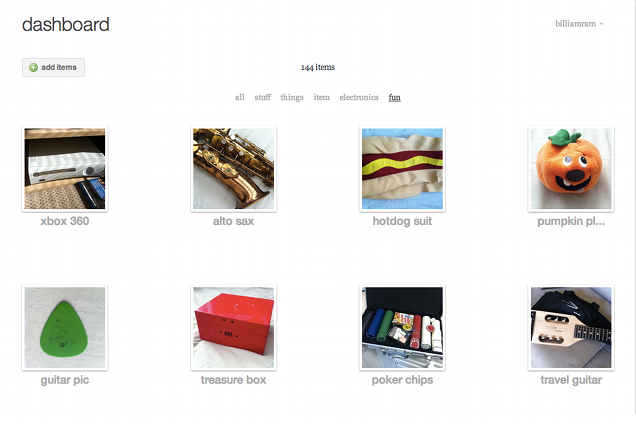
The main area for organizing and modifying items. Items are presented in a sparse grid to allow easy scanning without overloading the user.
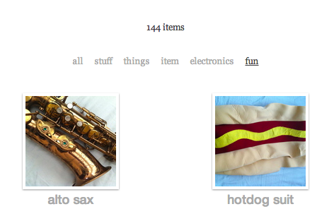
The item dashboard provides filtering by tags. Items quickly blur in and out based on the selected filter.
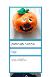
When the user clicks an item in the dashboard, it switches into editing mode where the item name, tags, and description can be easily set. Tab and shift-tab may be used to switch between fields and other items so the user doesn't need the mouse to enter information about their items.
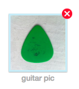
A red X appears when the user hovers over an item, giving the option to delete.
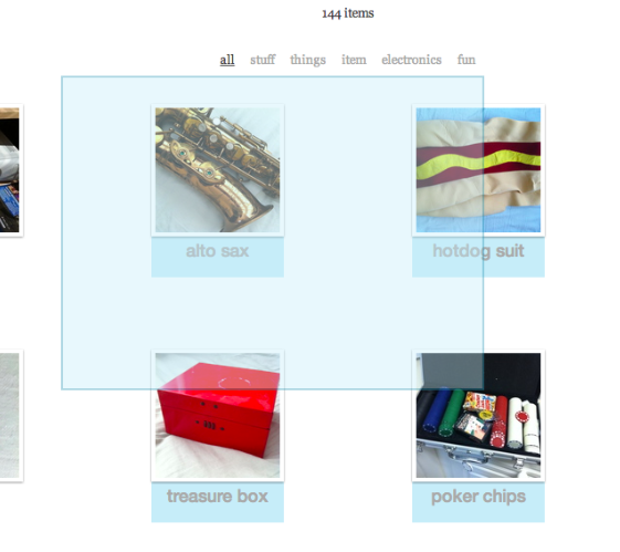
The mouse may be used to select a group of items at once. The user may also select multiple items by cmd/ctrl clicking individual items, or shift-clicking to select a range of items.
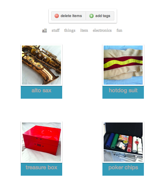
Once multiple items are selected, the action menu allows the user to delete or tag the whole group of items.
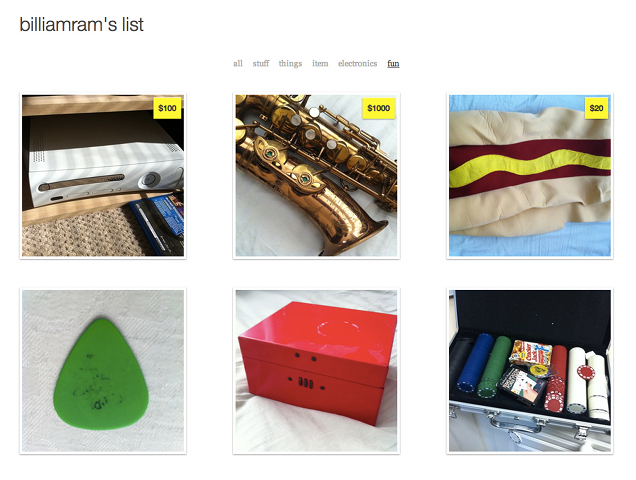
Each user has a page for displaying their items to the public. Items with a price specified will show a price tag. The filtering works identically to the item dashboard filtering. In the user's account settings, they have multiple options for the display size of items on their public page. Larger item displays would better suit a smaller collection, while smaller displays would suit a larger collection.
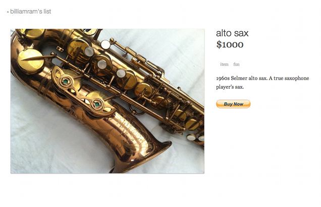
Each item has a page to display all of its detailed information. If the item has a price set, the price is shown and a paypal button is generated based on the user's email address or otherwise specified paypal address.